Transfer to Home Delivery
My Role: UX Researcher | May 2023
Overview
The OptumRx design team was working on ways to make the transferring of medications to home delivery a seamless process for customers. To do this they created an ideal state to have tested to make sure they were on the right path. Overall, participants were not impressed with the design and brought forth many pain points with it. After giving the findings presentation design needed to go back to the drawing board to better align with customer needs.
Terms to know
Home Delivery = when this term is used in the following text it is referring to home delivery medication or having your prescription medication delivered to your home
THings to keep in Mind
No client data is being shown in any of the images below
The target audience for this presentation was executive leadership
Research Goals
Understand if the idealized state of transferring a prescription design is
an intuitive user experienceDiscover the participant’s ideal journey when transferring a prescription to home delivery
Uncover user preferences when presented with the choice of checking out now or later after a prescription renewal
Reveal any information that is missing to improve the overall experience
Methodology & Participants
8 one-hour usability sessions via Teams week of 4/23/23
Participants were recruited from a third party vendor and identified as having at least one prescription on home delivery
One prototype was tested with four different tasks:
Transfer prescription to home delivery
Track progress of a transfer
Refill prescription through home delivery
Renew prescription
Top Theme 1: Participants want more detail through the transfer to home delivery process
Prior to transferring their prescription to home delivery participants:
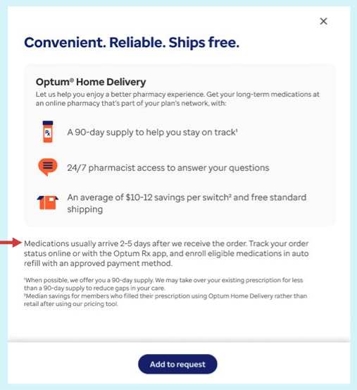
Wanted to see the price of the medication to know if switching
to home delivery would be worth
it to themShow a timeline so they know when they would receive their medication and if it would be to their home before they ran out
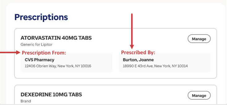
Clarity on information listed on the prescription screens would help give insight to the transfer process such as ‘prescribe by’ and ‘prescription from’
Mentioned their doctor is not the only one writing a prescription and could be someone else at the hospital so would be helpful to have a descriptive title
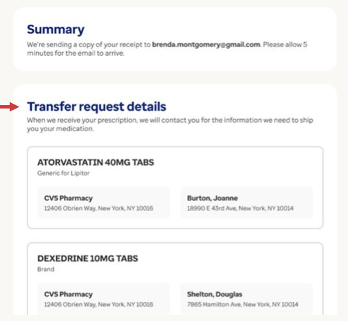
On the summary screen key information was missing
Clarity this was only transferring a prescription and not placing an order
More detailed next steps or instructions for what the user should do
A way to reach out to Optum incase they need help
Top Theme 2: Overall misalignment between the participant’s mental model & the design
At the end of Task 1 participants were left feeling uncertain about what they had completed
Five thought they placed an order for home delivery
Two discovered this was only the first step which they were unaware of before
One understood this was step one in the process of transferring
At the end of Task 4: renewing a prescription, most participants were left confused
Confused because they thought Optum would already have their payment information and shipping address
Wanted a way to verify their address and payment info quickly without going through a checkout process
Did not see a reason to come back to the site to checkout since they were already there
Top Theme 3: A want for Optum to take a more proactive role
Where can Optum help?
Optum can capture shipping address and payment inform at the beginning for a smooth and quick checkout
When submitting a prescription to transfer to home delivery allow users to continue to checkout
Have an easy way to set up auto renew and refill to limit the number of times a user needs to log back onto the site
Any issues that arise with the prescription transfer, refill or renew Optum would look to solve the problem prior to reaching out to the customer


