Complete Helmet
My Role: Product Designer | Team: Linh-Chi Nguyen, Laala Mari Jawara | Oct 2021 - Nov 2021
Overview
Tasked with envisioning a new user experience for the traditional bike helmet, our team set out to create a physical prototype of a new purposed user experience. We started by brainstorming features the helmet could include, then sketched and annotated the designs. The sketches also included ideas for a user interface the rider could interact with to access different settings relating to the helmet. Over two weeks, our three-person team created initial sketches, collaborated on a final sketch, gathered feedback from potential users, developed a physical prototype, and designed a user-friendly mobile app interface. Below are all the steps taken to create an innovative, visual, and physical prototype with features to enhance the rider's experience as well as a streamlined app for minimal and simple interactions.
Process
Step 1: Sketching
To start, we individually brainstormed several ideas for the helmet and user interface. The result was a series of sketches along with annotations to describe our ideas.
Design 1 included a mobile app as the user interface along with a helmet which included a four-point haptic system, Bluetooth capabilities, rounded speakers, safety lights, air vents, and a magnetic clasp. Design 2 had a user interface attached to the rider’s bike and a helmet that included safety lights, AI integrations, a camera, automatic fitting controls, and sun-blocking material on the exterior of the helmet. Lastly, Design 3 used a digital display along the front of the visor, a tap pad to control music, a microphone for voice commands, a safety light, safety pads, and fans to keep the rider cool.
Step 2: Function Analysis
After all the initial sketches were complete we inventoried all functions each team member included in their design (see All Functions). Next, we pulled out common themes amongst the designs that were effective to be included in the final design (see Common Functions). Thirdly we collaborated and voted on potential functions to push our design to be more innovative (see Potential Functions). The final product from this exercise was a concise list of features the whole team agreed on to be visualized in the final sketches.
All Functions: Blue notes show all the functions the team came up with within their designs.
Common Functions: Yellow notes show the common trends amongst the team’s designs.
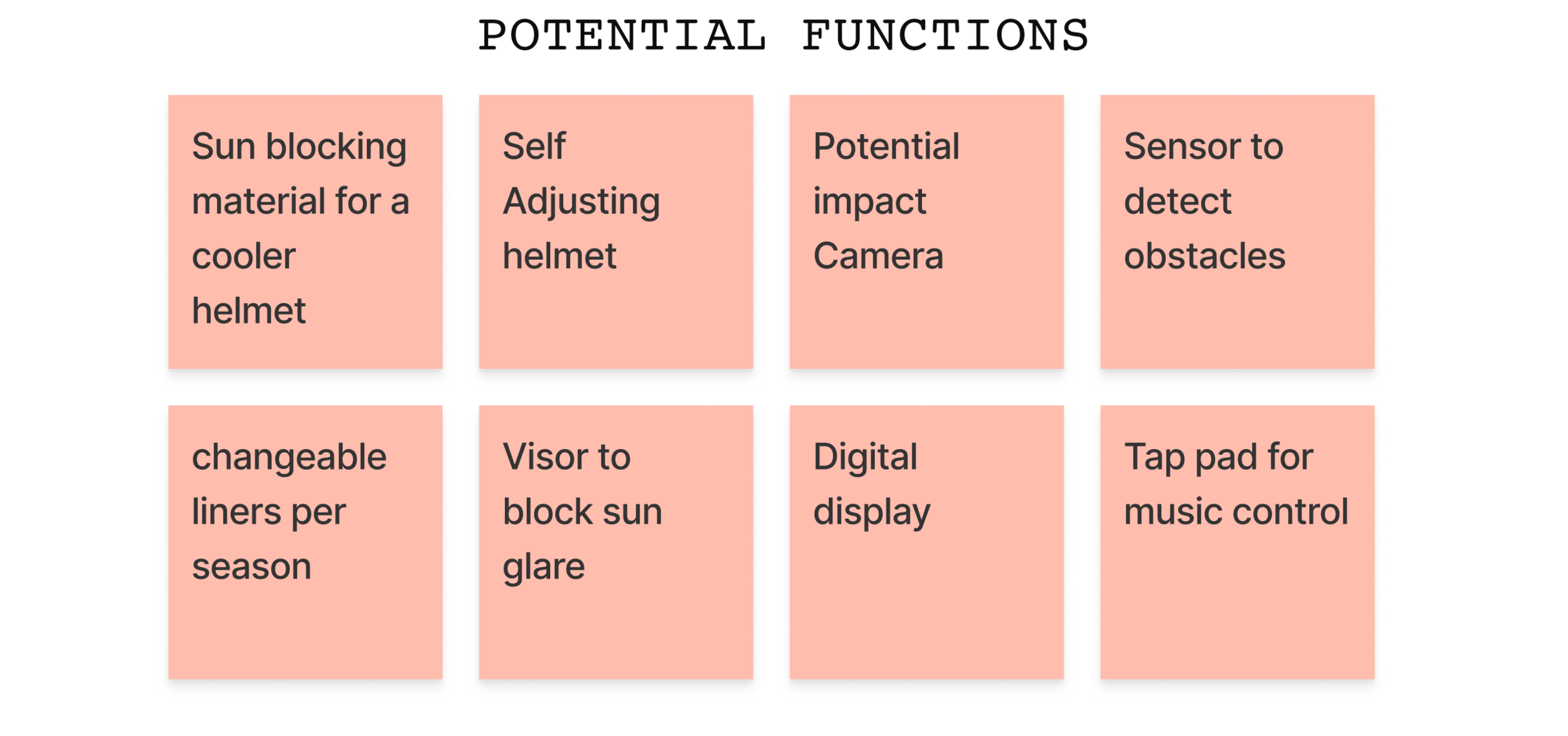
Potential Functions: Red notes are creative opportunities to include in the final sketches that the team voted on.
Final Functions: Green notes display a list of final features included in the final sketches.
Step 3: Final Sketches and Feedback
After the function analysis, final sketches were created of both the helmet and user interface. After finishing the sketches we solicited feedback from family and friends who had a variety of experiences when it came to biking. The feedback helped shape our final purposed design and brought to light elements we missed.
Helmet Sketches


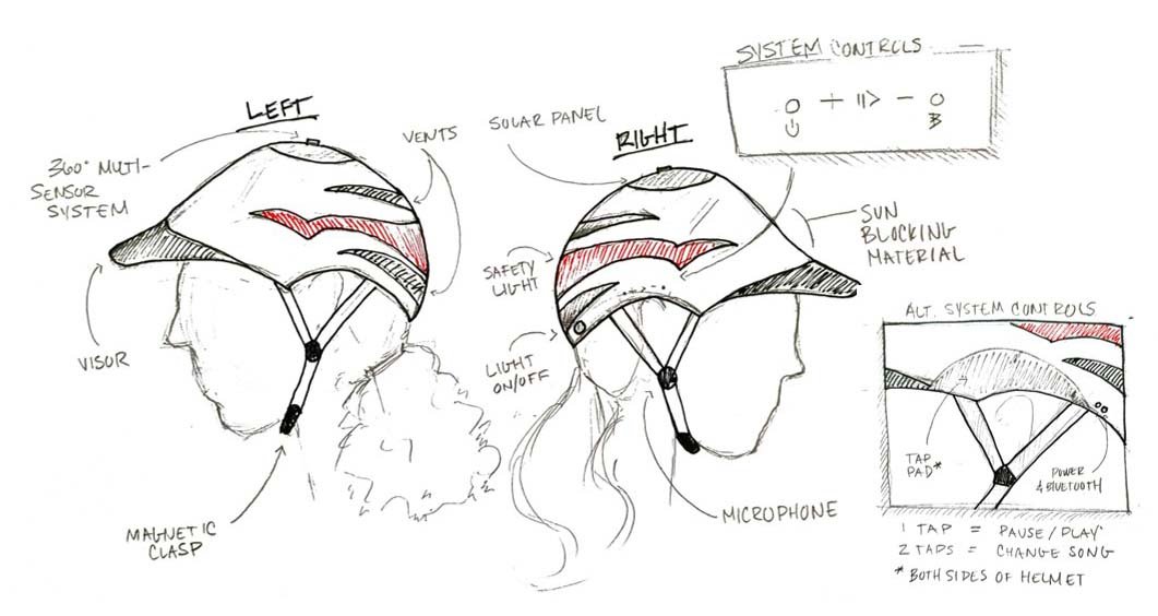
Product description: A stylish, comfortable, and safe design this helmet incorporates Bluetooth, voice-activated actions, and creature comforts such as interchangeable pads to keep cool or warm in any season. Key features include:
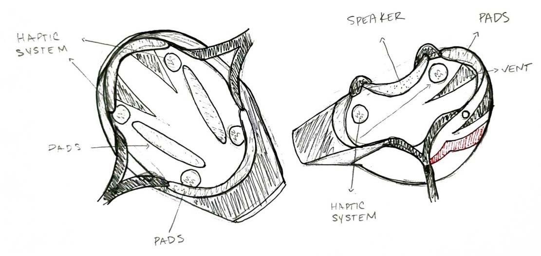
Top-of-the-line safety features: A 360 multi-sensor system that detects obstacles such as cars and people that will trigger the haptic system located in the interior of the helmet. Safety lights wrap around the helmet for visibility during night riding and are reflective during the day.
Comfortable all year long: Exterior is made of sun-blocking material to keep helmet cool, also a visor to block sun glare, and vents to promote airflow.
Advanced technology: Turns on automatically when placed on the head, tap pad for easy music control, and a microphone for voice-activated commands (i.e., sending a message, getting directions, changing music, or turning on the safety lights).
Utilizing solar power: The helmet is both solar and battery-powered to stay fully charged for long periods of time.
For the system controls, we presented participants with two options. Option A is a one-sided control panel with volume control, pause/start button, and light indicators for Bluetooth and power. Option B is a 'tap pad' to control music on both sides of the helmet with one or two taps of the fingers.
Helmet Feedback
Overall, the participants thought the layout of the helmet was well designed. The Bluetooth capabilities were thought to be helpful especially when navigating and listening to music. Participants stated having the helmet might inspire them to ride their bike more due to the increase in safety features offered. Other themes that emerged were:
1. Most features on the helmet were viewed as useful such as air vents, interchangeable pads, and sun visor however magnetic clasp, and speakers were questioned.
Air vents are great to have for added ventilation and could possibly be in multiple areas on the helmet.
Having interchangeable pads (i.e., mesh in the summer and fleece in the winter) is a nice way to be prepared for the different seasons.
Sun visor is useful for protecting against the sun, but the overall style was questioned and not seen as attractive.
Participants wonder if the speakers are too large for the rider, and how the overall sound quality would be?
The magnetic clasp was seen as not safe by two participants: “If I was wearing this and were to get in an accident I don’t think I could trust a magnetic clasp to stay secure and protect me.”
2. The safety features that were included, in the design, seemed like they would protect the user, but there could be improvements to the lights.
The large light was seen as being good for visibility however it lacked lights in the front which the participants wanted.
The 360-degree multiple sensor system which connects to the haptic system in the helmet was viewed as added protection and the “best feature a helmet could offer.”
3. When presented with two options for system controls, Option B (tap pad) was overall preferred.
Option B controls were seen as intuitive to use and didn’t require much thinking while riding your bike. Additionally, the tap pad was larger so it eliminated the need to be precise.
Option A controls might be challenging to use and find unless you are a skilled bike rider.
User Interface Sketches


Next, we opted to create a mobile app that serves as the helmet’s user interface (UI). We did not want to add any unnecessary features and most importantly stay away from a UI that required a steep learning curve. The overall idea was to keep the app in line with what users expect with any kind of device and activity app.
Our team envisioned a dashboard that would provide relevant riding information to users. Such as:
Information of the day’s riding conditions (once paired).
The recorded activity of rides shown in reverse chronological order. Users can then select a recording and review route information such as speed, wind, or temperature.
User Interface Feedback
Overall, participants thought the app was simple and intuitive and provided useful information. Other finding included:
1. The screens used a clean layout and had interactions users expected.
Utilized simple, user-friendly navigation and overall had a clean layout.
Reverse chronological order of the user’s rides was expected.
Steps to pair the helmet with the app via Bluetooth seemed straightforward.
2. Information that was visible to the user on the dashboard was expected and useful.
Thought having the weather and route predictions were helpful especially when you are about to go for a ride.
The dashboard contained just the right amount of information, but some participants were concerned if it would start to look overcrowded.
Step 4: Physical Prototype
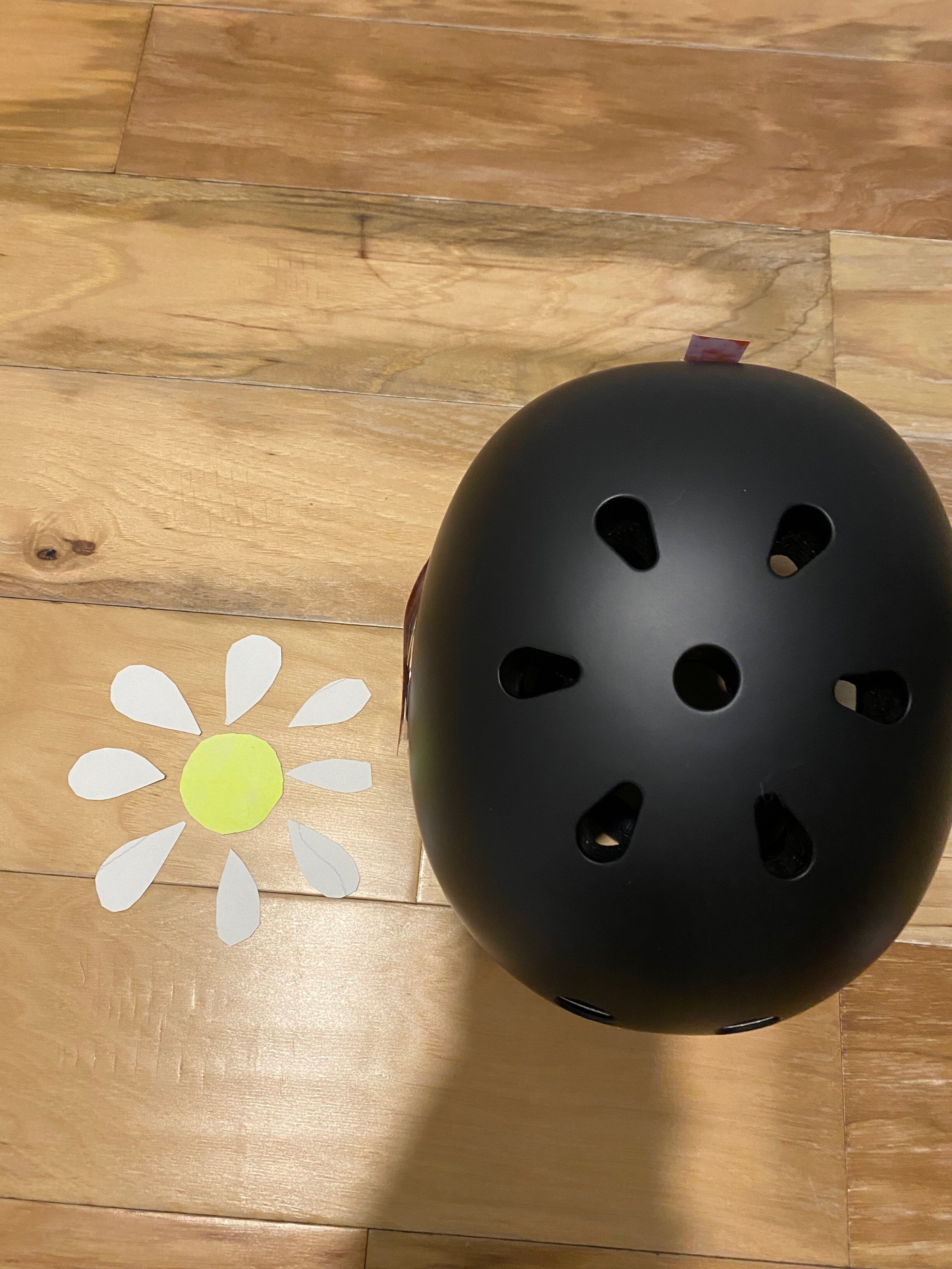
When crafting the physical prototype we took time to think about what materials to utilize along with what features could be visually created. Certain aspects were left out such as the voice-activated commands using AI. Using drawing paper, colored markers, and scissors, we produced different versions of the features before settling on the final design (see Fig 1). Color was used to signify different features. For example, orange represents the safety lights, white is the solar panels, and yellow is the 360-degree multi-sensor system (see Fig 2).
After the features were incorporated onto the helmet, we analyzed the participant feedback and decided to remove Option A system controls and replace them with the tap pad from Option B (see Fig. 3). The robust feedback allowed us to create a more rider-friendly helmet with features the user would expect.
Regarding the safety light feedback, we added lights to the front of the helmet to increase safety and visibility. Finally, we decided to place our solar power above the helmet as a supplemental option to the battery-operated system already in place.
Our final physical prototype included the visualized elements of a visor, solar panels, wrap-around light, vents, clip clasp, and a tap pad (see fig.4).
Fig 4. Final physical prototype with annotations
Step 5: Wireframing
After discussing the feedback, our team moved on to producing a mid-fidelity prototype of two user flows for the helmet’s user interface in Figma. Of note, because the feedback was generally positive, we did not integrate any major changes in this next iteration. See Figma wireframe here.
Flow One: Bluetooth Pairing
This first flow shows what the user sees after downloading the mobile application. The helmet must be kept within one meter of the pairing device, and a connection is made via Bluetooth. In addition, the app will request access to location, microphone, and music data, requiring the user to set their permissions. Any custom settings are set by the permissible application (i.e., if Google Maps is set to read route information in a ”low” volume, the speaker in the helmet does so as well).
Flow Two: Ride Forecast
The dashboard contains many of the same components we envisioned in the sketch prototype, including the day’s riding conditions and recent ride history. For each screen, we added a navigation menu at the bottom (for every screen), a settings icon, a solar-battery level indicator, and a bluetooth symbol to show the user that the helmet is connected.
The UI also contains many functions we envisioned in the sketch prototype, including the ability to review a previous activity, but we further developed the concept of a “Ride Forecast”. When selecting the "search” button in the home screen, users are able to improve the forecast by inputting a destination. The app then uses AI to developed an updated Ride and Safety Forecast, as well as the expected traffic levels and bike-friendly ratings (which mostly depends on the presence of bike lanes). Temperatures and Wind Speed are also estimated for the duration of the bike ride.
Lastly, settings and permissions can be easily adjusted via the upper right menu. There, the users can change the strength of the haptic touch as well as the amount of noise reduction with limitations to ensure rider safety.
Bluetooth Pairing Flow
Ride Forecast Flow
Design Justification
Design decisions. The design experience we imagined for the user of the Complete Helmet is one of comfort, ease, and peace of mind. Users could wear the helmet knowing they are protected with the 360-degree multi-sensor system that detects potential obstacles. Along with the haptic system that sends a vibration to the region where the obstruction is coming from. No matter if they were riding during the night or daytime they could utilize the safety lights by turning them on during low levels of sunlight or use their reflective capability during the day. The design takes a hands-off approach so the user can focus on their ride and not their phone. This is evident in the inclusion of a microphone and voice-activated commands.
Additionally, the design offers a long-lasting battery and solar panels, so the user never has to charge or change batteries (depending on where they live). In conjunction, the user interface we created is simple and intuitive and allows users to control all helmet settings while offering them information about their upcoming or past rides. Overall, our design ensures buyers feel their bike rides are being elevated and that it gives them access to all the features they expect and much more.
Reflecting on the design process. At the start of the design process, our team split up and brainstormed potential ideas for a new helmet design and user interface. We did this to not be biased by each other than could come together and collaborate on a finalized idea. After coming together, we realized we had many ideas on what features to add. So next, we decided to implement a feature analysis. Doing this helped us see where we aligned in our ideas and vote on potential functions to add. After coming up with the final sketches, we began soliciting user feedback and gathering supplies needed for the physical prototype. Throughout the journey, we collaborated as a team, and if a problem arose, we were quickly able to brainstorm a solution. In the end, by working efficiently, effectively, and collaboratively, our remote team was able to design a consistent physical prototype and mid-fidelity wireframe for a seamless user experience.
Reflecting on the user feedback. Getting user feedback was an essential part of our design process and helped us understand the needed improvements. To gather insights, we invited four participants with varying levels of biking interest, from a weekly rider to someone who only rides once every few months. We encouraged honest feedback and prompted the participants to answer what was working about the design and what changes would help the design. After receiving feedback, we synthesized the results into common themes and then outlined a list of priorities we wanted to address in the physical prototype and user interface. For example, insights led us to forgo the magnetic clasp idea and go for a traditional clip clasp because participants felt more secure with this option. Also, participants wanted to have safety lights in the front of the helmet for more visibility, so front lights were added. Lastly, for the helmet, we went for a more modern system control design, the tap pad, due to the positive feedback and concerns over the original option we chose. When it came to the user interface, we discovered participants thought our design met their expectations. Ultimately, the design for the user interface was validated during the feedback sessions, which led us to continue with the designs outlined on the final user interface sketches.


