Rx Partnership Website Research
My Role: UX Researcher | FEb 2023 – Jun 2023
Overview
Rx Partnership is a 501(c)(3) that “strengths the health and safety net by working through a network of clinic across the state to increase medication access for vulnerable Virginians.” With an already fully functional website this project will aim to uncover current usability issues on the home, donate and impact page and redesign them.
Process
To discover these issues a usability test and interview will be performed with six qualifying participants. Each participant will be screened with a series of questions to determine if they fit into the target audience. If qualified, they will be asked background questions then given tasks to interact with Rx Partnership’s website. Data from the interviews will be collected in the form of recordings, notes, and metrics. With the collected data common themes will be synthesized and presented in a comprehensive report. Along with participant data a competitive analysis will be performed on peers, in the industry, to understand what digital strengths and weaknesses they have and compared to Rx Partnership. The data extracted from this research will be package in a report and provided to Rx Partnership. At the end of the usability test and competitive analysis they will be able to have an understanding where they can improve areas of their website and a bigger picture of how to strengthen their digital presents.
After analyzing results from the user interviews and competitive analysis I am able to start crafting design for the public website. First, I will start out with understanding what information is needed by stakeholders while understanding their vision for their site. After an initial intake I will begin working on lo-fidelity designs that provide visibility into site layout. With approval I will move on to high-fidelity designs that utilize current brand standards. The homepage is the highest priority and depending on time this page will be prioritized.
User Interviews
Research METHODOLOGY
Method: 5 one-hour usability sessions via Teams week of 4/23/23
Participants were recruited from User Interviews and identified as having experience donating online and currently living in Virginia
4 Tasks were completed on the Rx Partnership website was tested with four different tasks: explore the Homepage, explore Our Work & Our Impact, donate $5, review donation email
Participant background findings
Donating Online
Overall participants felt comfortable donating online
There is a hesitation to donate to organizations who are not transparent about where their funding is going and a strong fear of being scammed
Amongst younger participants data privacy was important, and the less information they had to give the better
Most go onto a nonprofit site knowing how much they are going to donate because of their budget
Choosing an Organization
Usually, participants donate to organizations they have a connection with, or they hear advertising
Finds non-profits through work, family or friends, or advertising
Top Themes & Recommendations
Wanted a clear statement right when they get onto the site that let’s the user know what Rx Partnership does and who they serve
Solution: add a clear header bar to the home page
Wanted clear language on the site that they could understand. Throughout there was language that was not understood by participants such as partners with and without pharmacy, FLP, AMP, affiliated sites, broker model, etc.
Solution: update language throughout to be public-friendly or provide definitions along side words or acronyms users might not understand an impact when they donated and how they were helping others
A visual solution showing the impact on how the users donation was helping other
Solution: add visuals or statements on the donation form or in the confirmation email to provide donators a way to see how they are making an impact
Low expectation for a non-profit site to be up-to-date in their design, but commented the design looked about 10-15 years old
Solution: work towards a brand ‘refresh’ but adopting similar branding that matches current styles that the next generation of donors will expect to see
Task 1: Explore the home page
Navigation Bar
Navigation bar on RxPartnership’s website
‘Give Now’ stood out to all participants and they enjoyed having it visible on all pages while searching the site. Having this help make it more clear this is a non-profit organization.
‘Sign In’ falsely indicated to some that they would create an account and see their history of donations (n=3)
Top sections on RxPartnership’s website
Top sections
Almost all participants after landing on the homepage immediately read the Rx Partnership statement
After reading the statement (circled in red), participants were left confused about what organization does
They were looking for a clear, short statement to informed them what the organization does
Would choose to view the video vs reading the site info (n=1)
Middle sections on RxPartnership’s website
Middle sections
Seeing that RxP has been around since 2004 provided confidence on the legitimacy of the organization
Clinics with and without pharmacies was unclear to participants
Some suggested to have easy high- level information to read and understand the difference
Most scrolled past and did not say much about this
Footer on RxPartnership’s website
Footer
Recognizable partners and pharmaceutical partners provided confidence on the legitimacy of the organization
Additionally having an EIN number, address and phone number gave confidence this was a real non-profit organization
Effective Score for Homepage
Task 2: Our Work & Our Impact Pages
Medication List
Thought the information in ‘Who we are’ should be on the first page because it was clear language and informed participants about the organization
Like the visibility of the conditions the medication offered can treat but thought this didn’t include all the conditions
VIRGINIA Map & Why we exist
Enjoyed having a visual of the map but was left confused by the language used and some legend items
‘Left uninsured who are not eligible for Medicaid’ provided clarification on who the organization helps and was very clear
Customers Statements
Having names, photos, was a great way to make the organization more personable
Missing arrows to navigate from story to story and overall, the automatic scrolling was too quick to read the entire story
Impact Report
Loved “Every $1 donated provides $21 in medication value to patients.” This helped them realize the impact they were going to make
Many mentioned they were not going to take the time to look at these documents
The first one look ‘too long’ and one person mentioned could have accessibility issues
Task 3: Donation Process
Donation Form
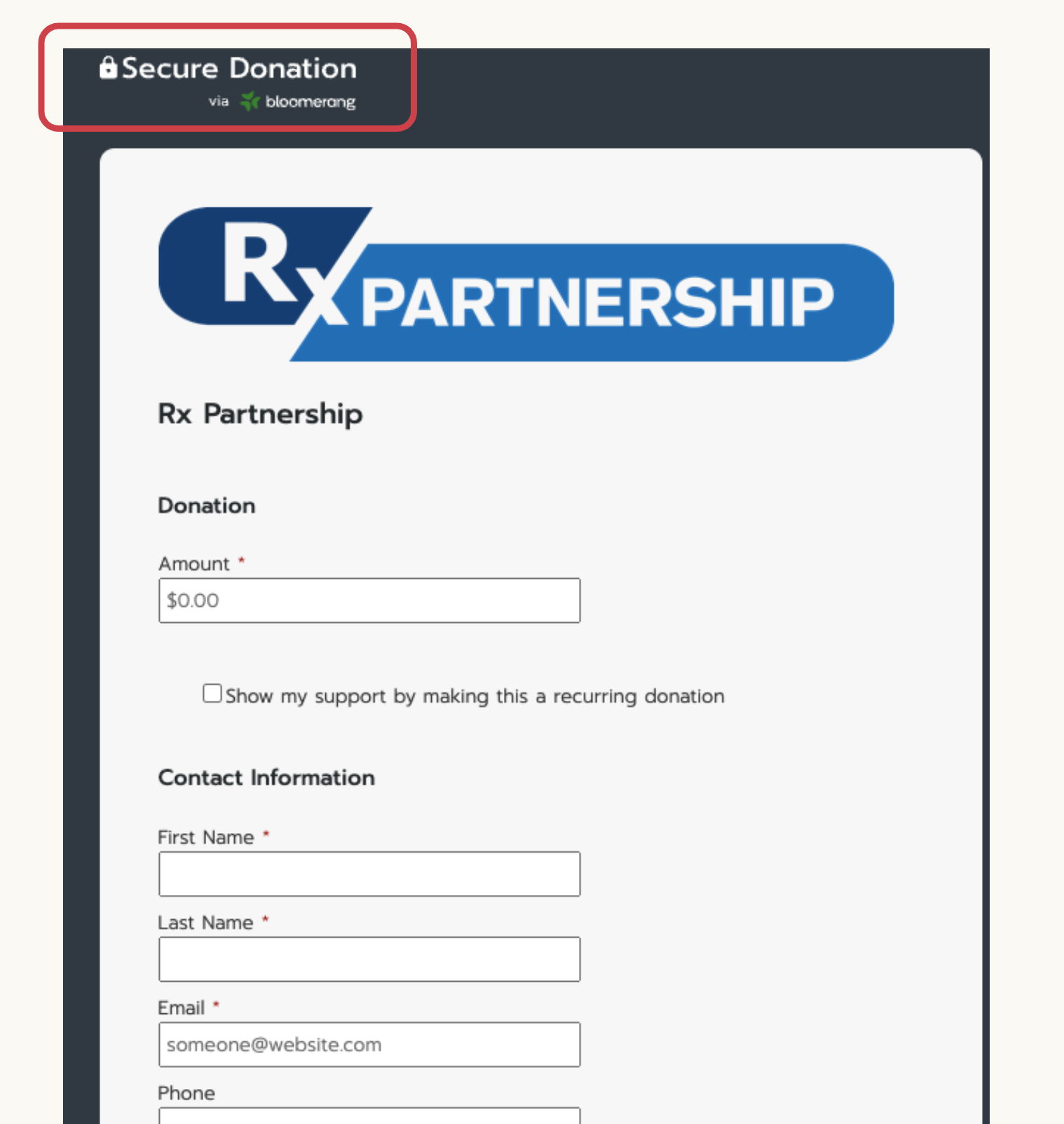
Secure donation stood out and like this so feel comfortable about sharing payment information Wanted a way to donate anonymously (n=2)
Monthly donation was very clear and all participants understood how to do this
Younger participants thought it was easy to use but looked outdated
Two participants were asked their opinions on receiving a thank you the letter and would like the option to opt out
Almost all understood what the offset bank fee was not bothered by this
Clear that the next step would be to click ‘donate’ and they would receive a confirmation emai
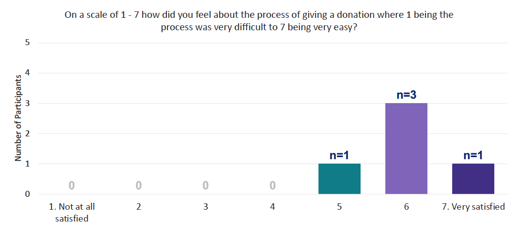
Difficulty score
Task 4: Donation Email
Wanted to see how ‘big’ of an impact they were making i.e. “Your $5 donation is $105 worth of medication to those in need.”
Thought it has all the information needed but looking for more visuals or an updated design
Information participants thought might be helpful: phone number, address, impact visual, or the EIN number
For each participant their name was place after ‘Hi’


