Enhanced Onboarding Portal
My Role: UX Researcher | JUn - JUL 2023
Overview
Optum wants to create a better onboarding experience for new OptumRx customers. This enhanced experience would allow members to set up their account, manage medication disruptions, and any other task all prior to their plan’s go live date. As a follow up study to the usability session completed in December 2022, these sessions focused on getting feedback on the updated designs from the last round of research.
Terms to know
Disruptions = when a prescription medication is no longer covered, needs prior authorization from a doctor or an alternate medication needs to be choose.
Enhanced onboarding = An initiative in Optum to create a better onboarding experience for new OptumRx customers. This enhanced experience would allow members to set up their account, manage medication disruptions, and any other task all prior to their plan’s go live date.
OptumRx = a full-service prescription drug benefit provider and a mail service pharmacy through home delivery.
(n=#) = sample symbol for the number of participants of the full user group that represent the finding
THings to keep in Mind
No client data is being shown in any of the images below
The target audience for this presentation was a project team which consisted of a UX designer, UI designer, UX manager, copywriter, director of product management, two product managers, and two developers.
Research Goals
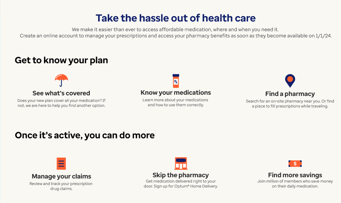
Landing Page: Understand the overall experience of the landing page to determine if the content meets participant’s needs and expectations
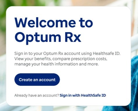
Create an Account: Observe whether the account setup process (excluding HSID) is clear and intuitive to complete
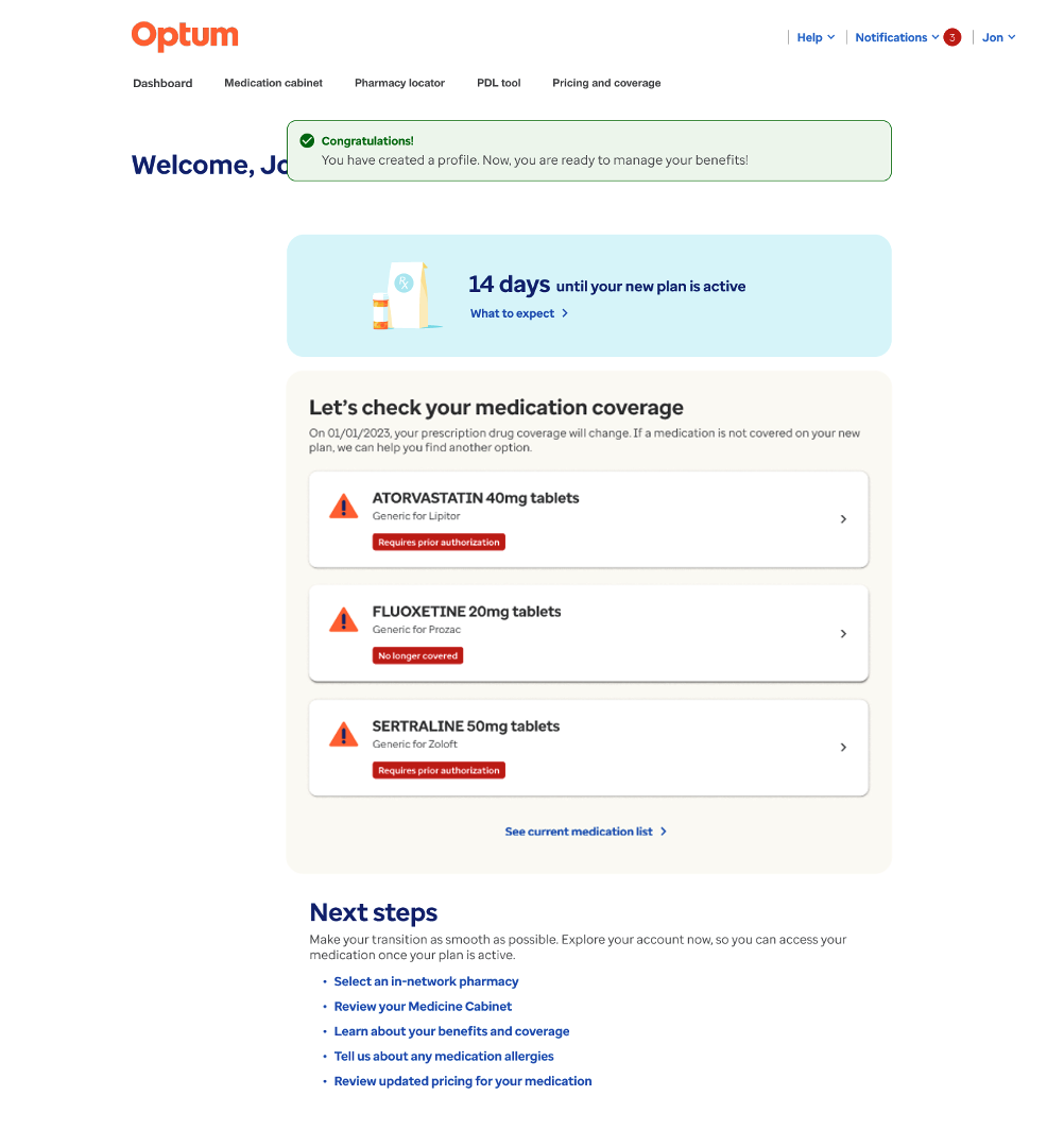
Pre-Member Dashboard: Find out if participants understand the disruptions content and recognize the medications shown require action to resolve
Overall: Discover if participants want to create an account and if this opinion changes after seeing the pre-member dashboard
Research Methodology
Method: 10 one-hour moderated usability sessions via Teams week of 6/19/23
Participants: Recruited from Leede and identified as having switched health insurance providers within the past year
3 Tasks: One prototype was tested with four different flows:
Landing page
Create an account
Pre-member dashboard
Top Themes
The landing page does not immediately communicate the value of creating an account
After creating an account and interacting with the pre-member dashboard, participants stated they were more likely to create an account because the dashboard provided them with relevant and personalized information
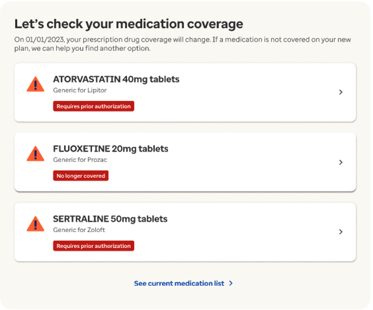
On the pre-member dashboard, disrupted medications went unnoticed, participants did not understand they needed to take action to resolve disruptions and that this was important step in the onboarding process
Task 1: Explore the Onboarding Landing Page
Meeting Expectations
Participants trusted their employers to choose a reputable PBM, and extended that trust to Optum Rx, rating the landing page information quite trustworthy
The landing page met or exceeded all participant’s expectations because most of the information presented seemed simple and straightforward
In 2022 participants questioned who Optum Rx was and if they could trust them
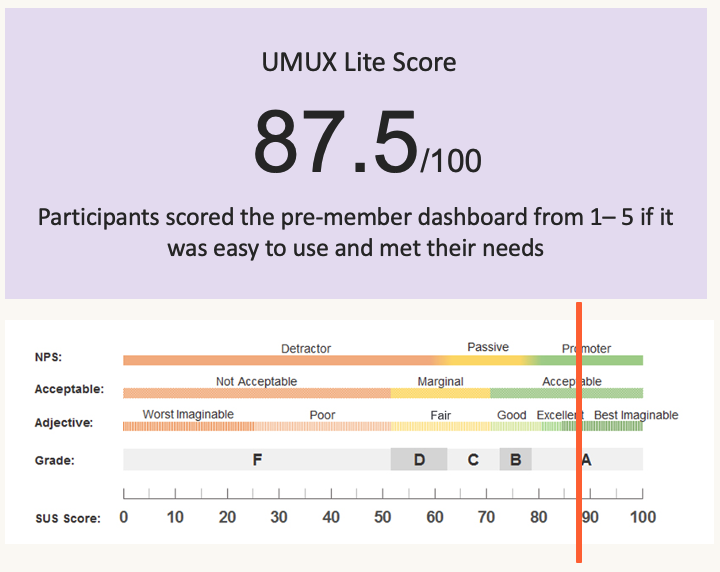
.5 increase from 2022’s score
Take the Hassle out of Healthcare
Thought features were clickable and available to them immediately
Participants expected to access personalized information on the public page without logging in
Expected to access personal information by clicking on the features
Having the ability to interact with features before creating an account would incentivize them to create an account prior to their plan going live
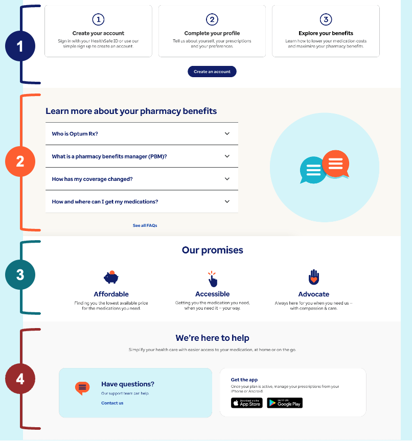
Other sections such as were thought of as nice to have and would be used if the participant thought necessary
Three simple steps
FAQs
Our promises
We’re here to help
Task 2: Creating an Account
After looking at the page participants were divided on whether they would create an account prior to their plan going live
6 would create an account to see personalized information, do research
prior to going live, if assured their data
was secure*or ‘to get it over with’4 would not create an account because they felt they did not have all the info needed, such as their insurance card or HSID (n=2) or they do not want to give out their info prior to going live (n=2)
Largely, users commented on how easy and straightforward it was to create a new account
Some expected the process to be longer and to be asked for more personal information such as medication history, etc. (n=2)
Step 1: Personal Information
Most participants did not notice the sentence about how to change information and where personal information came from (n=6)
By not understanding where personal data came from it made them concerned about data privacy (n=2)
Task 3: Explore Pre-Member Dashboard
Next Steps stood out as the most important section of the dashboard because it clearly listed out tasks they needed to complete
Inconsistent terminology (medication list, Medicine Cabinet, Medication cabinet) confused participants
Participants noticed the 'in-network' (n=2) badge and found
it valuable to be able to select their own pharmacy and view
their hoursParticipants expressed concerns about how their medication information was obtained since they were not asked to enter it
Disruptions Did Not Stand Out
Throughout testing the design was iterated to increase prominence of the disruptions – however, none of the iterations stood out to users or alerted them that they needed to act (n=10)
When asked, participants stated it is extremely important to be made aware of a potential disruption and would want to receive an email (n=8)
It was unclear to participants this list was only displaying disrupted medications and that other medication could be found by clicking "See current medication list"
Overall
After seeing the pre-member dashboard, participants stated they were more likely to create an account because it provided them relevant and personalized information.
Participants identified the benefits of creating an account such as:
Having a smooth transition to their new pharmacy benefit manager
Getting any questions, they have answered prior to going live
Solving medication disruptions
Recommendations
Landing Page
Provide a visual preview of what the pre-member dashboard has to offer to incentivize them to create an account upon entering the page
Ensure language clearly states users do not need any information such as an insurance card or HSID to create an account
Rework section to reduce confusion that features are clickable, provide deeper understanding what is available now vs. once active
Pre-Member Dashboard
Explore designs that quickly convey:
Solving a disruption is an important part of the onboarding process
Disrupted medications are different from other medications
Highlight key information users would be looking for such as price
Motivate users to explore further medication information
Use consistent language when referring to the full list of medications


