Presto Pasta
My Role: Product Designer | DEC 2021
Overview
Assigned with creating a voice activated kitchen appliance I set out to envision a small new appliance that could simplify cooking pasta. I started with storyboarding the purposed user flow of using this new appliance and gaining feedback to improve the overall design. Then made final sketches and created a physical prototype. Over two weeks I created a realistic physical prototype of a voice activated kitchen appliance that considers users feedback for an intuitive design. Below are all the steps taken to create the Presto Pasta, a voice activated pasta cooking appliance.
Process
Step 1: Storyboard & Initial Sketch
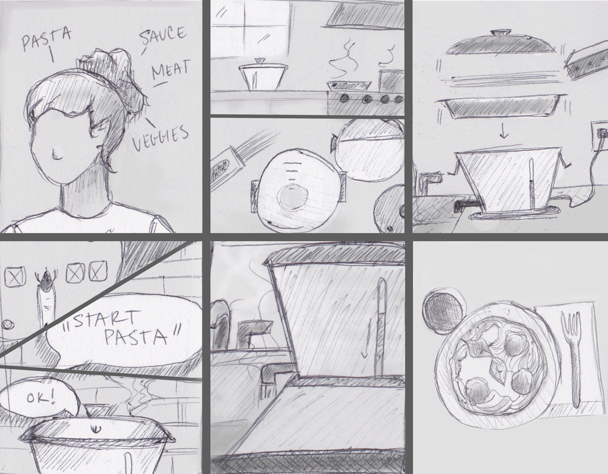
Storyboard. Visualizing the user flow, I created a storyboard using pencil, paper, and Adobe Photoshop. The storyboard captures at a high level the experience of using the Presto Pasta. Below is the storyboard (see fig. 1), which begins with a Jane starting to cook dinner for the family. Jane starts thinking about all the food needed for dinner including meatballs, sauce, vegetables, and pasta. With only four burners on the stove, she knows all of them will be used along with multiple timers. To make things easier and quicker Jane takes the Presto Pasta out plugs it in, ensures the spout is over the kitchen sink, and turns it on. After telling Presto Pasta to “cook angel hair pasta al dente”, the pasta cooker using voice recognition software then flashes a blue light inside the container to indicate how much water needs to be added. Jane adds the water and pasta to a tray that sits on top of the container then places the lid on top. “Ok, start pasta” instructs Jane and the Presto pasta starts while they proceed to do the rest of the cooking. The Presto Pasta boils the water, drops the pasta in, then self-drains into the sink. Jane is able to focus on the other foods that need to be prepared and doesn’t have to worry about cooking the pasta because Presto Pasta prepares perfectly cooked pasta every time.
Figure 1. Storyboard showing the process of using the Presto Pasta.
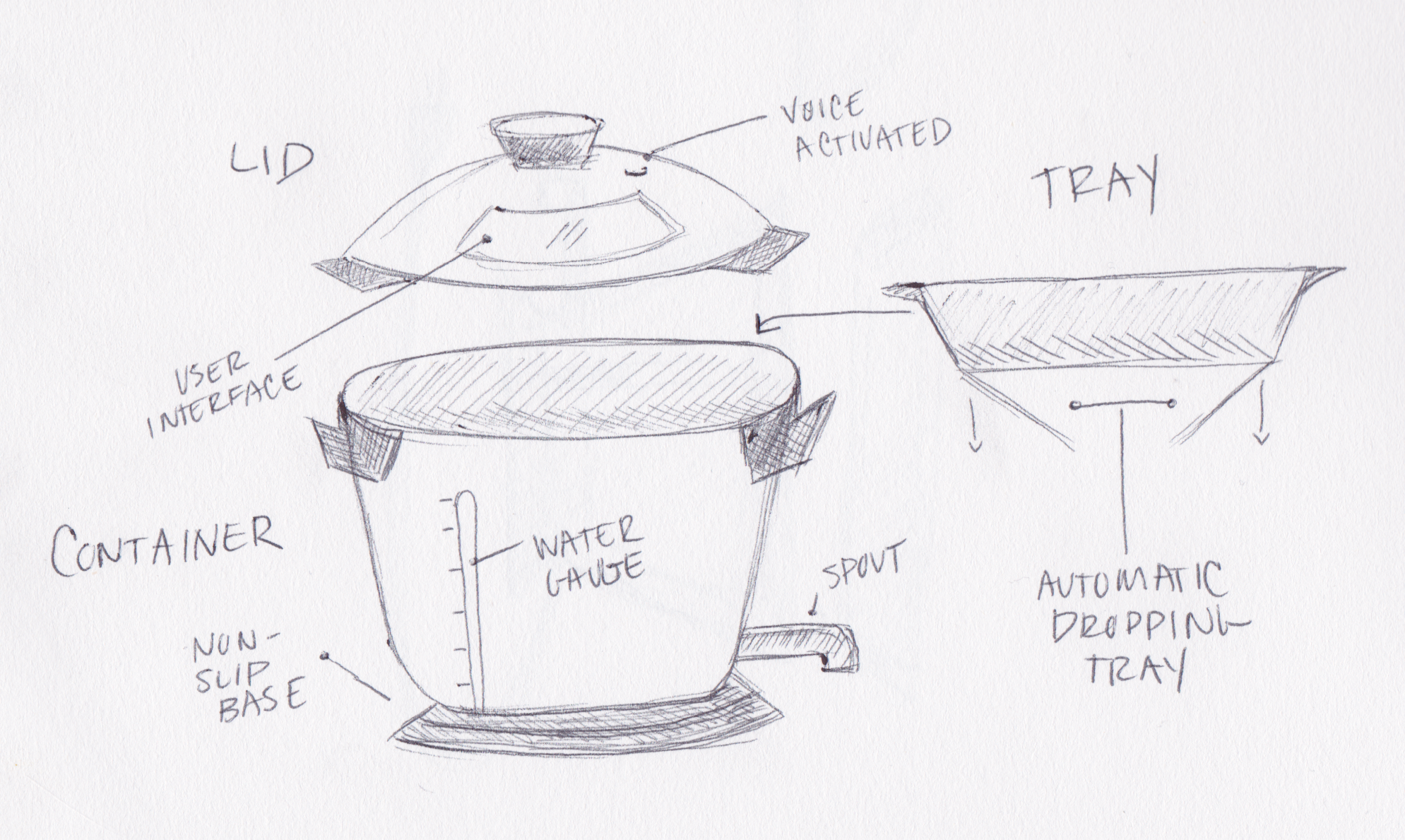
Initial Sketch. To start the design process, several sketches were done while brainstorming ideas on the specifications of the pasta maker. The result was a series of sketches of the main components of the Presto Pasta along with annotations to describe specific parts. Starting from the bottom of the container there is a non-slip base with a stainless steel pot attached to the top followed by a spout that drains water. Resting on top of the container is a tray that releases the pasta into the boiling water once ready. On top is a lid that includes the user interface along with holes to let steam escape (see fig. 2).
Figure 2. Initial sketch of Presto Pasta done with pencil and paper.
Step 2: User Feedback
Before proceeding further, I gathered feedback from family and friends by walking them through the storyboard and initial sketch. By doing this I was able to identify important aspects of the design that were overlooked. The following themes emerged from the user feedback:
1. Having the design limited to just being placed on the counter next to a sink could be an issue for some users.
Worried about counter space and environment and the limits of having space next to the kitchen sink available for the appliance.
Consider different options that would allow the user to either place it in the sink or not drain and notify the user when it needs to be drained.
2. The spout caused concern since it did not have a shut-off valve
One participant mention wanting to save the water if the recipe called for ‘pasta water’.
“Shut-off valve would be helpful if you were not able to place it close to the sink”
3. Participants wanted an easy way to store the Presto Pasta
Suggestions for a collapsible design and removable spout
A cord that retracts or winds up for easy storage
Not too large of a device under 6 quarts so it wouldn’t take up much counter space
4. Presto Pasta seemed like an appliance that both the experienced cook and novice would enjoy.
Even as a person who dislikes cooking, I do believe the Presto Pasta sounds both simple to use and an appliance I would readily buy/use.
Seems like a good solution for both a cook and someone that hates the kitchen.
Along with the top themes, participants were asked what features they expected to be in the Presto Pasta. Figure 3 lists out the common functions they thought would be included in each portion of the appliance.
Figure 3. Features participants expected to be included in the presto pasta.
Step 3: Final Sketches
After reviewing user feedback, I created final sketches with suggested changes. Starting with the lid the interface moved to the base to ensure it was dishwasher safe. For the tray a scale was added, to accurately measure the serving size of pasta. The automatic dropping tray was updated to a mechanism that would drop the entire tray and rise it up once the pasta is cooked. This allows users to easily get the pasta out of the container. For the container, the water gauge was removed due to its lack of purpose while the Presto Pasta is cooking. The spout now includes a telescoping ability to accommodate for various lengths from the counter to the sink. Additionally, the spout is removable for cleaning and has an indicator to show hot water is about to come out. For the base, the interface shows the user what selections they have made along with a microphone for voice recognition. The plug is removable for easier storage and now the base includes feet to lift it off the counter and for the ability to place it in the sink to drain.


Step 4: Physical Prototype
Creating the physical prototype I gathered supplies such as a hot glue, paint, foam paper, wooden pegs and an old cooking pot (see photos above). Taking into consideration users’ feedback I started first constructing the base out of foam and small wooden pegs to represent the feet of the appliance. After, I attached a spout and created the telescoping feature for more controlled water draining. For the tray, I painted the scale to represent how much pasta a user should add and represented the lowering mechanism with black foam paper. Inside the container, I indicated the blue flashing light with paint which tells the user how much water to add. The user interface was left out of the physical prototype due to the focus on the actual appliance, but in future renditions this would be explored.
Figure 4. Presto Pasta exterior annotated.
Figure 5. Annotated tray.
To use the Presto Pasta a user would first plug the appliance in (1). Next, they would say what they are cooking and for how many people “cook small shell pasta for two people”. Then inside the container, a light would flash blue to indicate how much water to add (2). After adding the tray to the top of the container (3) the pasta scale would indicate how much pasta you need to add (4). Once you reach the weight the Presto Pasta would say “please add the lid and let me know when to start.” After adding the lid the user can say “start cooking”. When the pasta is done it will self-drain into the sink (5) and let the user know their pasta is ready “all done” (6).
Figure 5. Visualizing the process of cooking pasta using the Presto Pasta.
Reflection
To create the Presto Pasta, I went with the prototyping method of a physical prototype and utilized other techniques we learned in class, such as storyboarding and sketching. We learned about physical prototyping in week four. Specifically, in the lecture, Dr. Sarcevic went into detail about creating a physical prototype. Some of those aspects were to feel overall: size, weight, textures, smell, and appearance. Additionally, watching the video IDEO Shopping Cart we saw how having a physical model for interacting with contributes to the success of something highly physical such as a shopping cart design. Reflecting on these learnings made me pursue this type of prototype because kitchen appliances are something you touch and interact with vs. something purely digital like software or a website.
Moreover, I would not use a low-fidelity or high-fidelity prototyping method in the physical component of the Presto Pasta. However, I could see utilizing these methods in future iterations of creating the user interface. Another technique I used was storyboarding, which we learned about in week two. The article UX Storyboard Creation: A Complete Guide For Beginners states that storyboards are memorable and emotionally engaging. I wanted to create a storyboard to be able to have users connect with the story and what it would be like to use the Presto Pasta to give more accurate and helpful feedback.
Three things I will remember about prototyping after taking this course are that a prototype doesn’t have to be ‘complete’ or ‘pretty’. The exercises in the book Sketching User Experience gave many examples of how quickly sketching out your ideas and utilizing the objects around you (such as a sticky note) can create a prototype. The second thing I learned is the primary purpose of creating a prototype is to get feedback. Building off the last point, getting user feedback does not have to be a complete idea. The course brought to light that frequent iterations and changes to a porotype after user feedback will result in the best possible design. Finally, I learned that your first idea is not your best idea. During our sketching exercise, we were constantly encouraged to keep coming up with ideas and push the boundaries. Continually improving applies to prototyping because there is always a way to improve the design to make it best for the end-user.


