Mobile Homepage Layout
My Role: UX Researcher | jan 2021
Overview
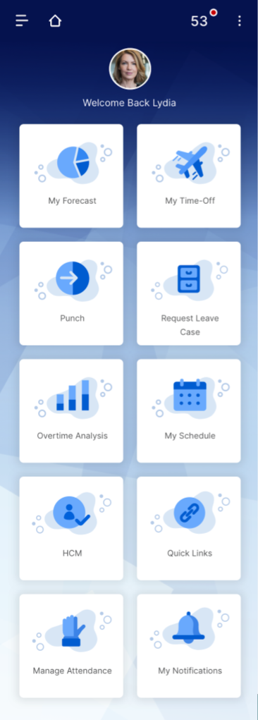
The mobile app team at Ultimate Kronos Group (UKG) wanted to test two different layout designs, one was where options were shown in a traditional list and the other included icons in a tile format. Overall, the test was inclusive as the participants were split on which layout they preferred. It was uncovered that really it was behind the homepage that really mattered to them and that they were able to get their job done efficiently and quickly.
Terms to know
Punch-in = clocking in either before, after or during a shift as an hourly employee
Request leave = in this case if an employee has requested to take any sort of leave from work they would let their manager know who would let HR know and that would start a leave case. In this work I had the HR specialist act as if they were starting a leave case.
(n=#) = sample symbol for the number of participants of the full user group that represent the finding
Research Goals
Understand if the most useful content is shown on the following tiles:
Manage Leave
Punch
Manage Attendance
Figure out how users feel about scrolling on the two mobile homepage layouts
Discover user's preference of layout on two mobile homepage designs
Research Methodology
6 UKG customers who work as HR specialist
1 hour session Via GoToMeeting
Tested two semi-functional prototypes, List and Thumbnail, of almost equal scrolling length
Prototypes and tasks were rotated per user
Tiles tested
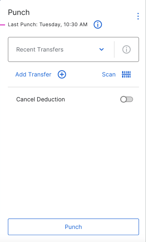
Punch
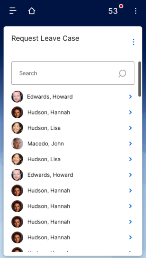
Request Leave Case
Manage Attendance
Top Themes
When ask what the next step would be, after landing on a tile, users found it very intuitive for the Request Leave Case and Manage Attendance tile
Overall, it was thought the List and Thumbnail layout were very similar and participants could see positive and negative to both
Participants understood the tiles shown, in the layout, would change depending on which profile you are in, e.g. employee, manager, HR
Task 1: Request Leave Case
Searching for an employee or seeing an employee list, was the expected first step for opening a leave case (n=6)
The search feature was intuitive and understood by all participants (n=6)
Would like the capability to search by employee number (n=2)
e.g., would be helpful if there were multiples of one name in the company so they can choose the correct employee
Thought the employees shown were the managers’ direct reports (n=4)
Would expect the employees to be listed alphabetically by last name (n=3)
Expected to click on the employees’ name or arrow, to the right, to continue and it would open a separate page to enter leave case details (n=5)
The details would consist of selecting what type of leave and starting date (n=4)
Thought the employee list was representing leave cases that are open, pending or closed for one employee (n=3)
Confusion around the multiples of Hannah Hudson’s name in the list (n=3)
Task 2: Manage Attendance
Would like purpose to what is being placed at the top, middle or bottom of the list (n=3) possibly by priority (n=2)
Having ‘Cancel Deduction’ instead of the employees’ name confused users on its meaning and purpose (n=4)
Employees’ names are nice to have in order to immediately see who had attendance issues (n=2)
Intuitive to participants the next step would be clicking on the arrow (n=5)
Expected to see more detailed information about the warning, deduction, or suspension after they click on the arrow (n=3)
Expected ‘View Attendance’ would lead you to a page with all your employees and details about each one (n=3)
Task 3: Punch Tile
Participants wanted to see additional information listed in ‘Last Punch’ specifically if this was a punch in or punch out (n=4) and the date of the punch (n=1)
Under the info icon after ‘Last Punch’ they thought if clicked on it would show more information about the employees' last
punch (n=4)Info such as if it was a punch in or punch out and other details i.e. location, department, and date
Expected to see the employee's schedule listed on this page (n=3)
Would like to see a warning if the employee forgot to punch in or punch out or was about to punch in or out twice (n=2)
List v. Tile Layout
List Layout
Tile Layout
List Layout Findings
4 of 6 participants preferred this layout
Enjoyed that more information was shown on the first screen without having to scroll
Felt easier to quickly absorb the information because more tiles are above the fold
Participants noted ‘less scrolling’ even though the thumbnail layout has almost the same amount scrolling
With ‘less scrolling’ they thought this would result in less errors e.g. accidently clicking on a tile when they meant to scroll
Tile Layout Findings
2 of the 6 participants preferred this layout
With larger icons participants felt it made the tiles easier to understand (n=4)
Participants thought the layout was straight-forward and what they needed to do was all there (n=3)
Thought this design was more modern looking then the list layout (n=2)
Participants stated they preferred layouts with less scrolling and felt this layout required more scrolling than the list layout (n=3)
Recommendations
Overall recommend moving forward with the list layout for any future designs
Request Leave Tile
List employees alphabetically by last name
Manage Attendance Tile
Add purpose to the ordered of the list
Punch Tile
Add information after ‘Last Punch’ specifying if the user punched in or punched out
Under the info icon, if clicked on, show more information about the employees' last punch such as: if it was a punch in or punch, location, department and date


