Rx Partnership Website Redesign
My Role: UX & UI Designer | JUn 2023 – sep 2023
Overview
RxPartnership is a 501(c)(3) that “strengthens the health and safety net by working through a network of clinic across the state to increase medication access for vulnerable Virginians.” With a fully functional website this user experience design project aims to improve the current state of the home page to align with prior research conducted with five participants.
Process
The first step to this project was conducting research, from there I was able to analyze the results from the usability tests and competitive analysis and start modifying the RxPartnership’s public website. To start the design process I took time to understand what information my stakeholders thought was necessary and develop a deeper understanding of their vision for their site. After an initial intake meeting I begin working on low-fidelity designs that provide visibility into site layout. With approval I moved forward with creating high-fidelity designs that utilize their current brand colors.
Analyzing Research
Taking the research findings discovered in the usability test I was able to compare it to the current design and annotate it with suggestions (seen in the yellow circles). After discussing this with my project stakeholders we agreed on changes that would make the homepage better align with user needs. Our main focus was:
Removing the sign-in button because it caused confusion
Highlight a singular statement that delivered the purpose of RxPartnership
Drive public users to donate to the cause
Ensure there was multiple data points that informed users on the legitimacy of RxPartnership
Layout & Sketches
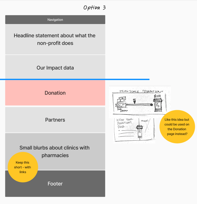
The below photos shows layout options for the RxPatnership’s homepage. Taking their original layout I rearrange sections to better align with user expectations and needs. Additionally, in the third option I added a donation section to add more visibility on how donations would be used if they chose to donate. After completing the three options I showed it to my skatholders who made comments shown in the yellow circles. Overall the comments centered around removing content and adding in a donation section.
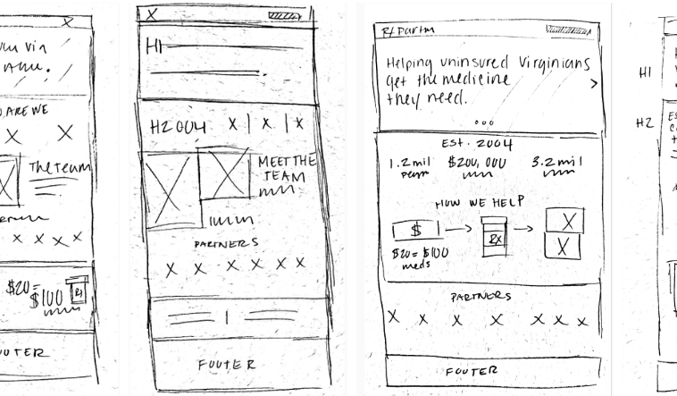
After the site layout was approval I began with initial sketches to get an idea of the overall homepage layout. A few things I wanted to keep in mind was having a simple statement of what RxPartnership does at the top, visualize how donations help people in need, and highlight key partners that the public would recognize.
Low-Fidelity Designs
After completing the sketches I went on to create low-fidelity designs. When creating these designs I did not use color, to focus the attention on content and overall placing of elements. Each of the main section were involved in multiple versions of the designs in order to iterate and try out new ways of visualizing the information.
Header section


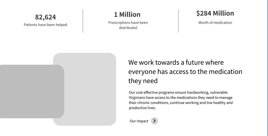
Data & Our Impact section


Dontate Section


High-Fidelity Design
To complete the project took the sketches and lo-fidelity designs and began making multiple version that included RxPartnership’s current branding colors and imagery. The challenge was to create a design that was both pleasing and implementable. I wanted to ensure what I created had the capabilities to be developed by my stakeholders. The final design focused on:
Streamlining content and surfacing only high-level information on the home page
Making a bold and impactful statement that informed users what the organization does and who they serve
Surfacing real people who were helped my RxPartnership
The impact of donating
How much of an impact the organization has made so far by including when they were founded and how much they have served the community in dollar amounts
Removed from the home page was any information that confused participants in the user testing, such as ‘sign-in’ button at the top and any information about clinics with and without pharmacies. In the end, I created a streamlined design that highlights key information and can be easily implemented.


