Time Management Design Exploration
My Role: Team Leader | May 2021 - JUN 2021
Process
Step 1: Interviews
Ten interviews were conducted to gain more insight into the life of a working student. Interviews ranged from 30 minutes to 1 hour and were semi-structured. All participants were employed either part-time or full-time and in post-graduate education.
“I don’t know how to balance everything, breaks do not exist. I will rest when I have the time but I don’t want to miss out on any moment”
Top Themes From Interviews
Participants use digital calendars to stay organized in their personal, work, and school life (n=5)
Participants use physical mechanisms, such as sticky notes, to ease stress and ensured they had a reminder to get important stuff done (n=4)
They were looking for (or missing) direction from work to guide them on how to have a work/life balance (n=4)
Hobbies, such as cooking or gardening, took a 'back seat' when it comes to other priorities like school and work (n=3)
Work and school often spill over into home life, especially if work applications are downloaded on their mobile device (n=3)
Step 2: Gaining Empathy
As a group, we took a step into our user’s life by participating in two empathizing activities.
Diary Study 1
A five-day in-depth diary study where our team would set an alarm for different times each day. This alarm would signify that it was time to get ready for work. At that time the alarm would go off our group would write down how we feel in a journal about going to work at that time. This study’s goal was to gain insight into how it is to have a varying work schedule.
What we learned:
There was no way to set up a routine that would last week to week. With a varying work schedule it challenging to set up when to wake up, eat, and take a break.
Members reported being stressed to figure out when to get homework done.
Would take time away from being with the family especially during evening hours.
Diary Study 2
A five-day in-depth diary study where our team imagined what it would be like to care for a child. During the day as different events occurred, we would write down how it would be different if we had a child to care for.
What we learned:
There needs to be significant energy put into planning the day. With child care to consider and certain drop-off and pick-up times, you need to ensure everything gets done during that time frame.
Work events set up outside of work hours (after 5:00 PM) can be stressful. After 5:00 PM would be when dinner is getting made and the whole family is home. If there is a work event at this time it could push activities later and cause your night routine to get messed up.
Step 3: Sketching
To start out we came up with three initial concepts and each sketch out an idea.
Heart Rate Work Monitor
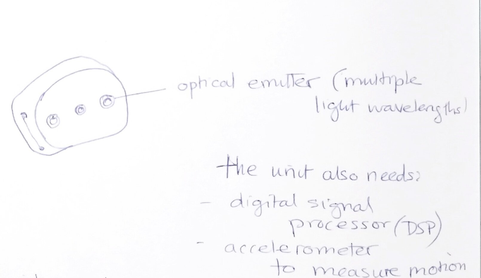
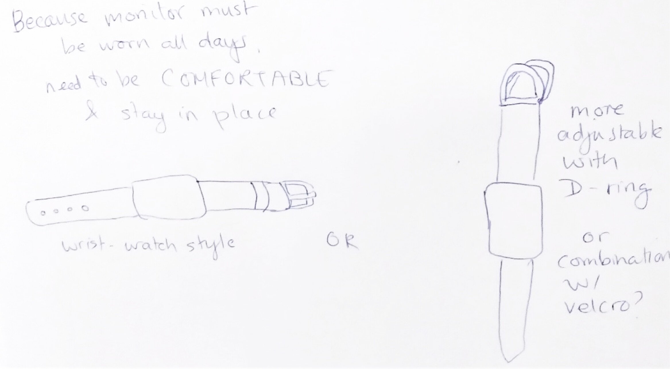
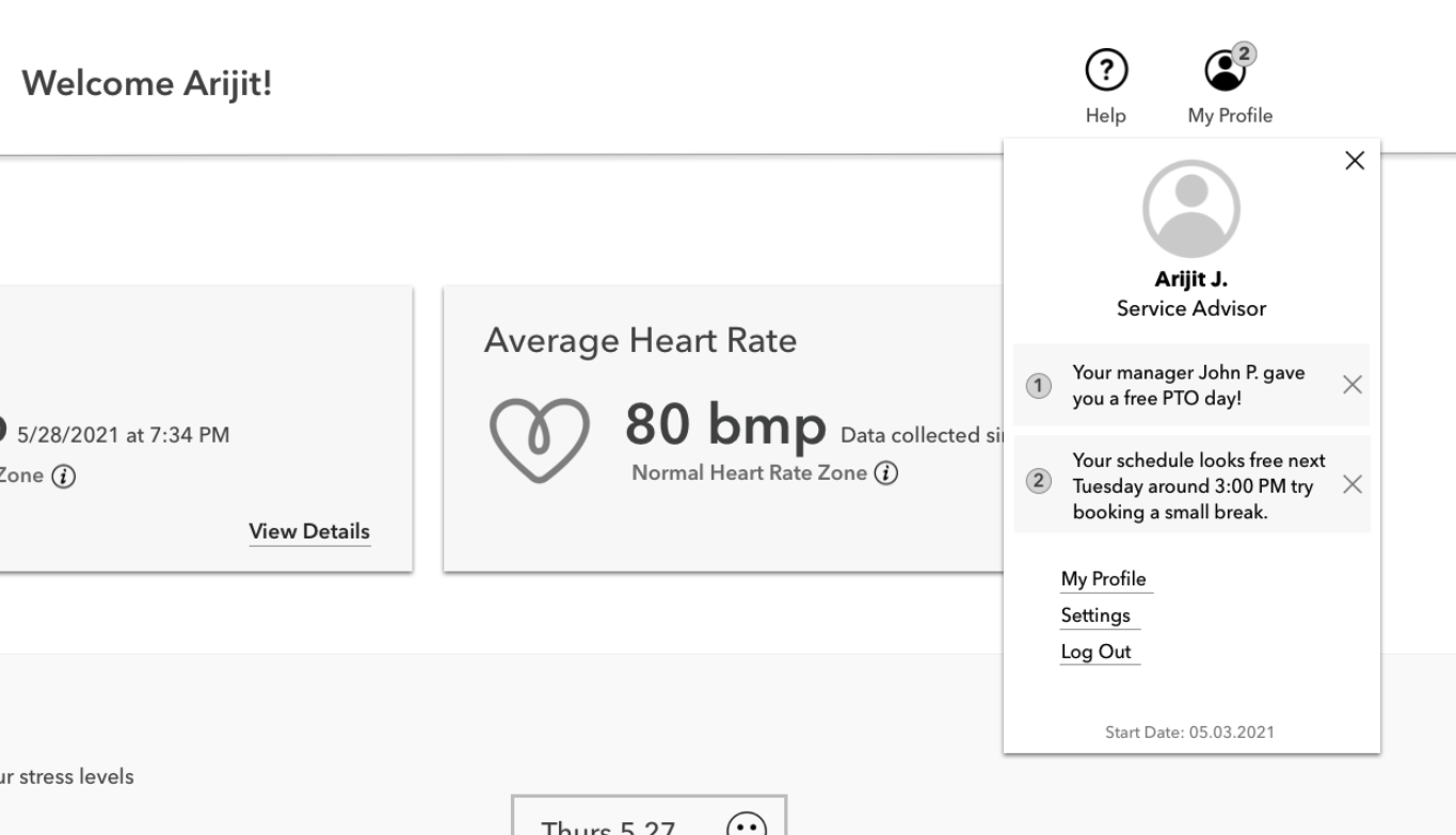
A device designed to check an employee's heart rate with a sensor located at the top of a lanyard. The readings will take place during work hours so managers can recognize worker fatigue and signs employees are stressed out. This will help managers realize how to divide up responsibilities and understand how their team is handling the given workload.

Desk Break Cube
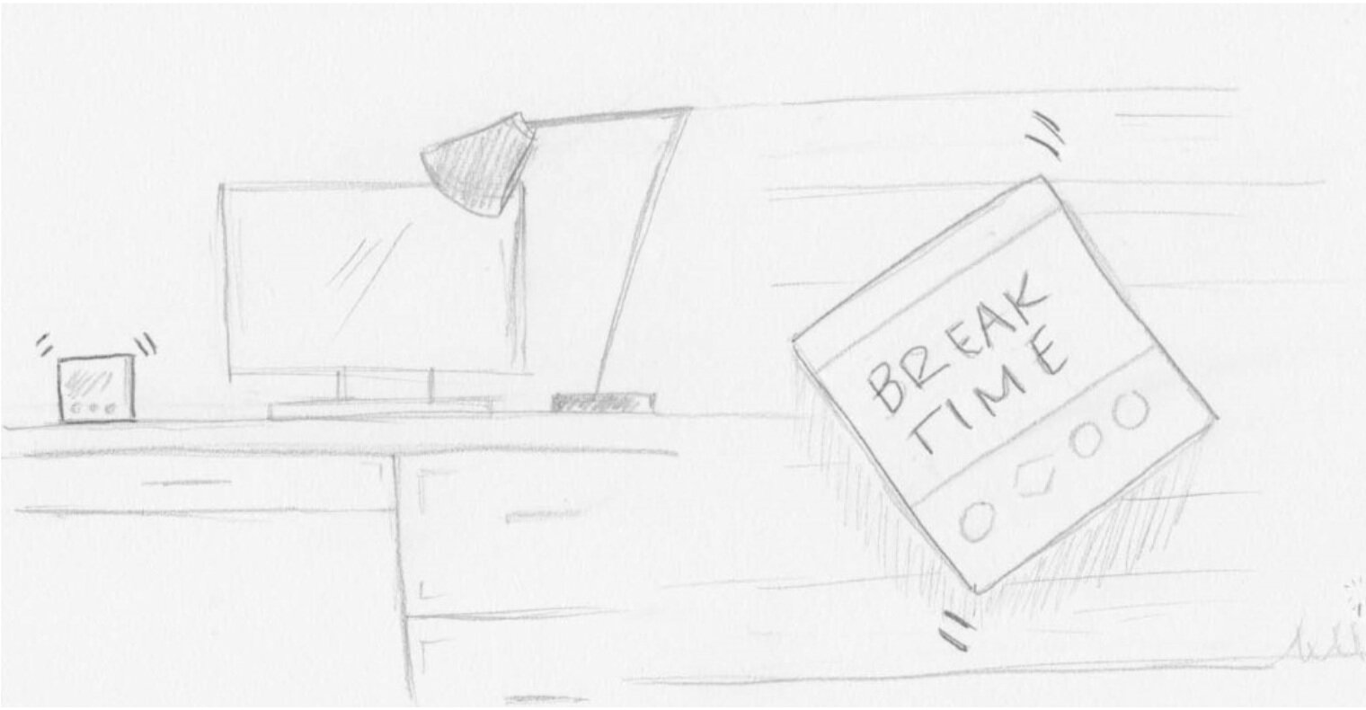
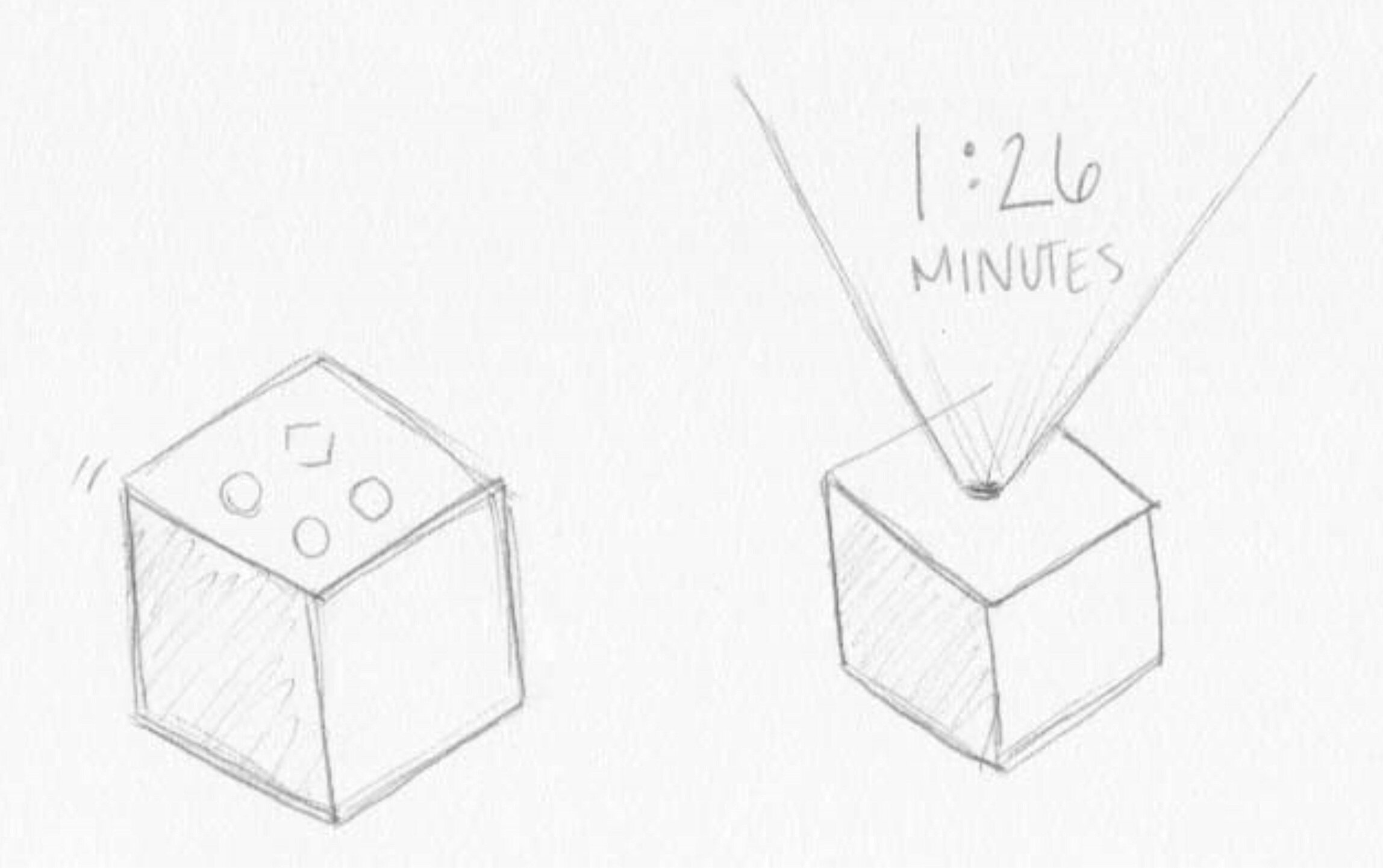
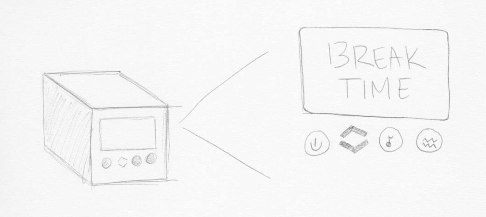
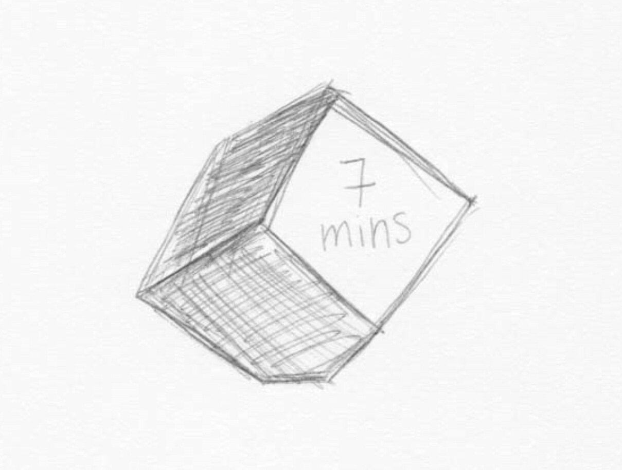
Taking small breaks throughout your day can be simple, but setting another alarm sounds daunting. The Desk Break Cube is a small, designed cube that lets users chose set intervals of time of when they would like to stop working and take a break. Once the timer has been set the cube will sit on your desk and look beautiful, but when it’s time to take a break, it will vibrate or play soft music to let you know it is time to take a break. The purpose of the cube is to remind users to take a break to encourage work, life, and school balance and assist with their mental and physical health.
Lunchtime Calendar Checker
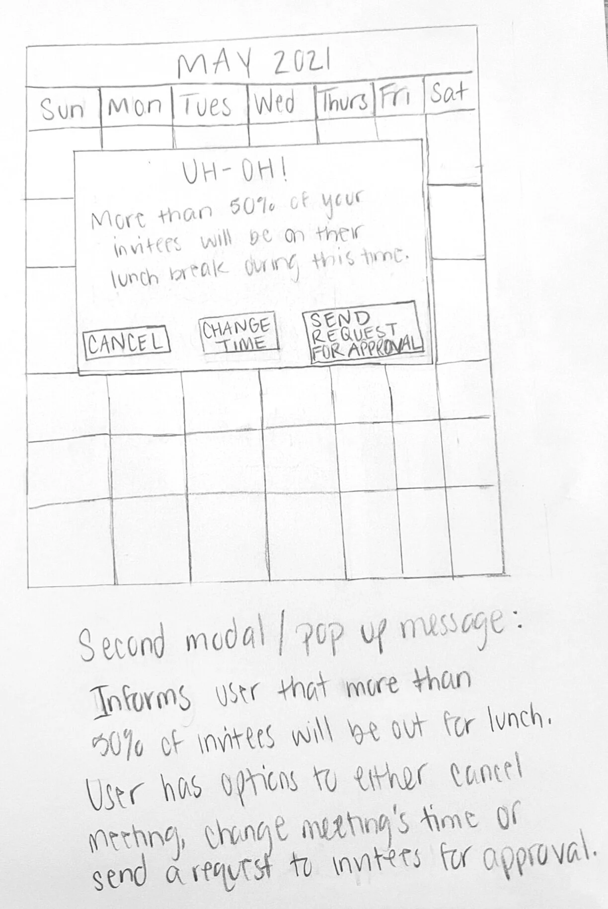
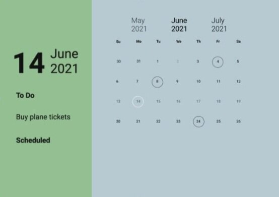
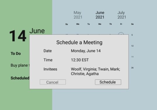
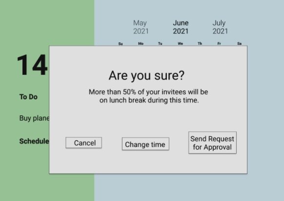
This is designed to work with calendars on mobile platforms. If more than 50% of attendees have lunch during the meeting time, it will have a pop-up and require an override to schedule the meeting. Being aware of lunchtimes and the need to have this break during the day and remind meeting organizers to be aware of invitees’ time (see fig. 3).

Step 4: Evaluating and Improving Designs
For the heuristic evaluation, we utilized Jakob Nielson’s ten usability heuristics for user interface (Nielsen, “10 Usability Heuristics for User Interface Design”). With further exploration of the designs a few design issues were found along with strengths. As a team, we took feedback from the evaluation and updated all designs to ensure they aligned with all the heuristics.
After receiving feedback on all the designs, we further developed them into high-fidelity prototypes. Using Figma and Sketch we added interactive elements, color, copy and really brought the designs to life.
Heart Rate Work Monitor



Break Desk Cube


Lunch Time Calendar
Step 6: Usability Testing
To perform the interviews, we started by writing questions that would give us information on how much time they are at work and in school, what the culture is like where they work, if they take any breaks, and if they have time to destress during the week. After answering the questions, we had the participant open the prototypes and interact with the design. In the case of the Heartrate ID Monitor, the design was personalized to the user to have a more realistic experience. Overall, we found that we needed to eliminate extra information and streamline navigation, but we did receive several positive reactions to the esthetics.
Final Thoughts
After rigorous testing and iterations for our final solution, we purposed the desk break cube as the best for our users. This solution is individualized per user and could be utilized by a variety of people. Its simple interface is easy to use and understand and most importantly it is not an intrusive extra task to be performed by the user.
